Overview
The health snapshot for an app. One screen tells you whether traffic, speed, and stability are where you expect, and every number is a doorway into the detail behind it.
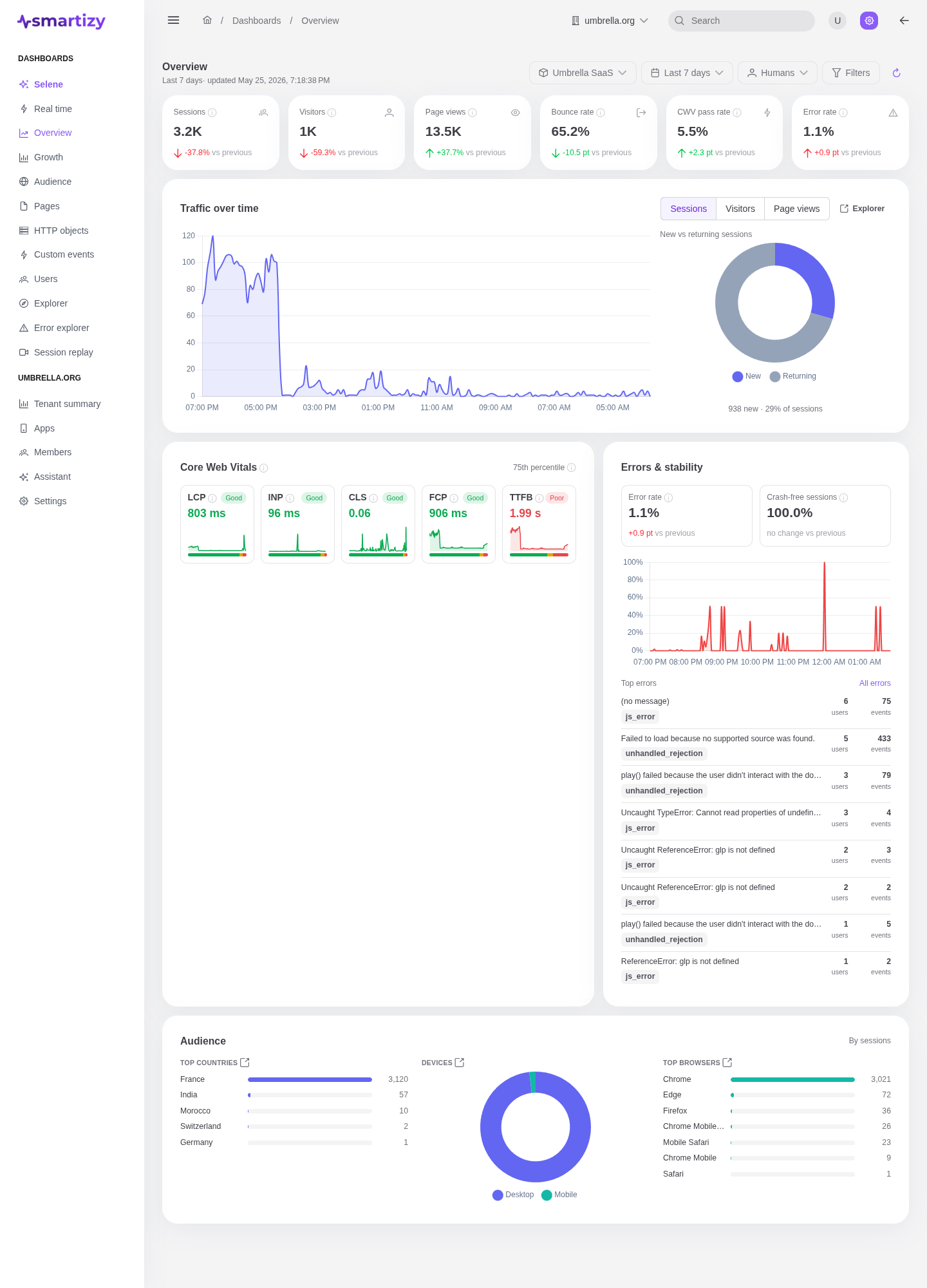
Open Overview to start a session of reading your data. It is the dashboard you check first thing in the morning and the one you watch after a release. It scopes to the app, period, audience, and filters set in the scope bar.
What it answers #
Is my app healthy right now, and how does it compare to last period? Overview groups the answer into four lenses: how much traffic you have, how fast the experience feels, how stable it is, and who is visiting.
The KPI strip #
The top of the page is a strip of headline numbers. Each one shows its value for the selected period and the change versus the previous equal-length period, so you read level and trend at a glance.
| KPI | What it measures |
|---|---|
| Sessions | Distinct visits in the period. |
| Visitors | Distinct people behind those sessions. |
| Page views | Total pages loaded. |
| Bounce rate | Share of sessions that left after a single page. |
| Core Web Vitals pass rate | Share of page loads meeting the Good thresholds across the vitals. |
| Error rate | Share of sessions or page views that hit an error. |
Each KPI links into the Explorer for drill-down.
Traffic over time #
A time-series chart plots volume across the period. Toggle it between Sessions, Visitors, and Page views to read the same shape three ways. Beside it, a new vs returning donut splits sessions by whether the visitor is new to the app or coming back, a quick read on whether you are acquiring or retaining.
Core Web Vitals #
Five p75 cards report the experience the slowest quarter of your visitors get, the number Google's thresholds are defined against. Each card carries a Good or Needs-work rating and a sparkline of its recent trend:
- LCP, Largest Contentful Paint: how soon the main content appears.
- INP, Interaction to Next Paint: how responsive the page feels to input.
- CLS, Cumulative Layout Shift: how much the layout jumps around.
- FCP, First Contentful Paint: how soon anything renders.
- TTFB, Time to First Byte: how soon the server starts responding.
Errors and stability #
This section answers whether your app is breaking. It reports the error rate, the crash-free sessions rate (the share of sessions with no error), and a list of the top errors by occurrence. For fingerprints, new issues, and the handled split, open the Error explorer.
Audience snapshot #
A compact read on who is visiting: top countries, devices, and top browsers. It is the summary version of the full Audience dashboard, which adds cities, a geo map, and operating systems.
Drilling in #
Overview is a launch pad. Every indicator deep-links into the Explorer, where you can re-plot it, split it by a dimension, change the metric, and share the result as a link. Read Overview to spot what changed, then drill in to find out why.