Custom events
Track the actions that matter to your business, not just page loads. Anything you send with
amb('event', ...), a sign-up, an add-to-cart, a plan upgrade, lands here so you can
measure conversions and key flows alongside performance.
The auto-collected dashboards cover how your site performs. Custom events cover what your users do. You define the events, attach a value, dimensions, and tags, and this dashboard turns them into a catalog you can explore. See Track custom events for how to send them.
What it answers #
- How often does each conversion or key action happen?
- How many distinct users and sessions trigger it?
- What is the total and average value behind an event?
- How does an event break down by a dimension, like plan or variant?
What you see #
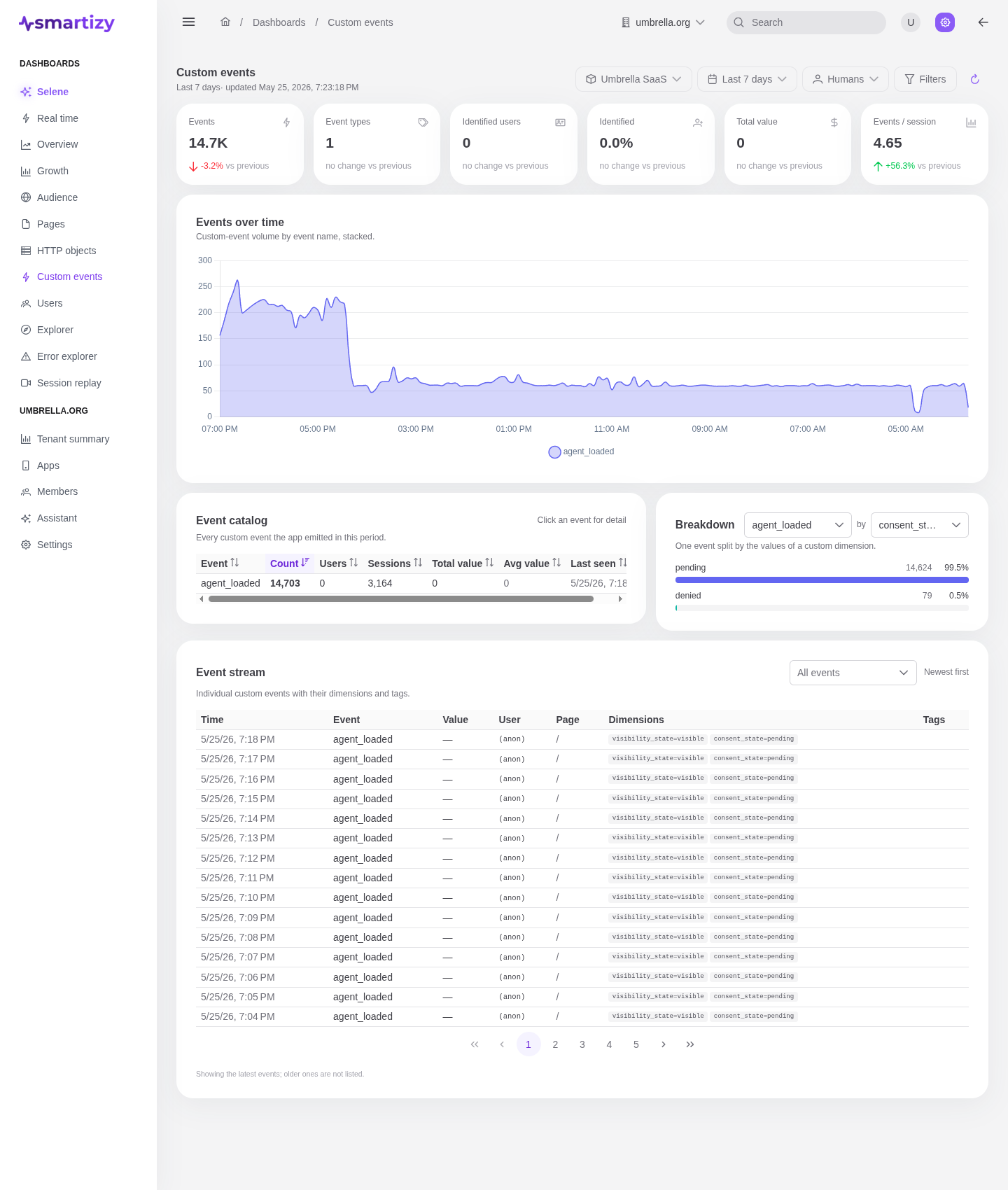
The dashboard reads the app, period, audience, and filters from the scope bar. The KPI strip leads with the period's headline numbers, each compared to the preceding equal-length window:
- Total events, every custom event captured.
- Distinct events, how many different event names fired.
- Conversions, the count of identified-user activity behind those events.
- Avg value, the average of the numeric
valueyou attach, in the period's dominant unit.
An events-over-time chart stacks volume by event name, with the long tail rolled up
into an other series, so you can watch a launch land or a flow drop off.
The event catalog #
The catalog is the heart of the dashboard: one row per event name, ranked by volume. Each row shows the event, its count, reach (users and sessions), value (total and average), dominant unit, and when it was last seen.
| Column | What it tells you |
|---|---|
| Event | The event name you passed to amb('event', ...). |
| Count | How many times it fired. |
| Users | Distinct identified users who triggered it. |
| Sessions | Distinct sessions it occurred in. |
| Total value | The sum of the attached numeric value. |
| Avg value | The mean value per event. |
| Last seen | When it most recently fired, to spot a flow that has gone quiet. |
Breakdowns and the live stream #
Pick an event and a dimension to split it, and the breakdown shows each value's
count, users, summed value, and share. This is the A/B view: split add_to_cart by
variant to compare experiment arms, or upgrade by plan to see
where revenue concentrates.
The live event stream lists the most recent events newest-first, each with its time, event name, value, user, page, dimensions map, and tags. It is the fastest way to confirm a new event is arriving with the shape you expect.
Worked example #
A SaaS product wants to track plan upgrades. The app sends, at the moment of upgrade:
- event name
upgrade, value the monthly price, unitUSD, - dimension
plan=pro, dimensionfrom_plan=free.
The catalog now shows upgrade with its count, the distinct users who upgraded, and the
total MRR added. Splitting by plan reveals that Pro drives most of the revenue while a
new Team tier barely converts, a clear signal for the pricing team. The live stream confirms each
upgrade as it happens during a launch.